The maps below illustrate geographic features highlighted through the use of several different spectral layer combinations. I was tasked with using ERDAS Imagine to identify three geographic features in the Olympic mountain range in Washington state. We were given pixel value (DN) data and the location of three value spikes in various spectral layers from Landsat 5 satellite imagery. The pixels that were constituents of the spikes represent some topological feature on our map. Using the, "inquire" tool in ERDAS Imagine, I scanned the provided raster image to identify the areas where the pixel value equaled the ones in the spike range in their respective histograms. Knowing that higher DN values represent brighter pixels and lower values representing darker pixels, I used this as an optical guide to assume prospective areas based on their brightness. Landsat 5 satellites have six spectral bands to capture electromagnetic radiation of different wavelengths. Representing these wavelengths through colors that are visible to the human eye allows us to see EMR wavelengths that are present in these images but impossible for us to see.
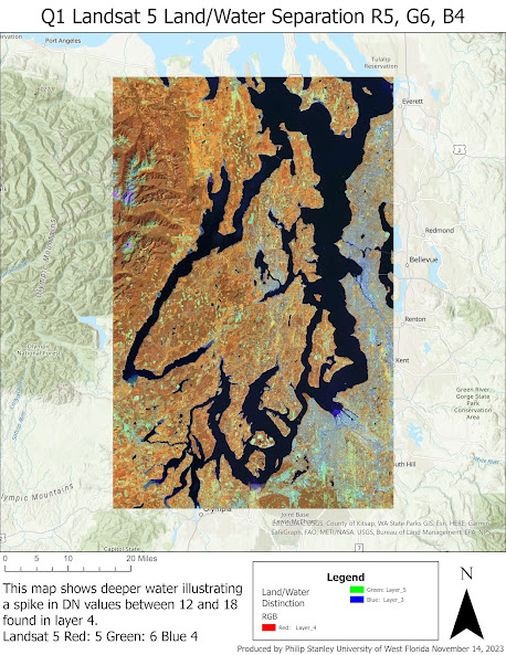
The first map shows deep bodies of water. I was tasked with locating the feature responsible for a spike between pixel values 12 and 18 in the near infrared spectrum. Knowing that this would be a dark value and already having my image in a NIR color combination, I used the inquire feature to measure the pixel values over these dark bodies of water. They fell within the desired range expect when the pixel value brightened as the inquire tool was moved over shallow waters. I researched different layer combinations that are typically used from representing a strong distinction between land and water. ESRI had one that they recommended for use on Landsat 8 satellites. I experimented with it and was pleased with the result. The wavelength combination was: Red - Layer 5 (shortwave infrared), Green - Layer 6 (SIR Thermal), Blue - Near infrared.
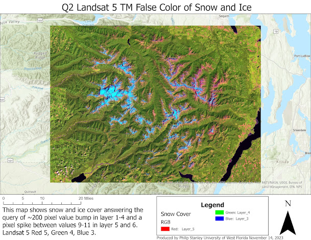
The next map indicates snow cover in the Olympic Mountain range in a TM False Color combination. This means that red is ascribed to layer 5 (SWIR), green to layer 4 (NIR), and blue to layer 3 (red). This provided a great image representing the vegetation accurately in green and allowing different constituents of the snow and ice to be represented in shades of blue and the surrounding exposed rock in pink and red. I had to find the feature that represented a spike in the 200 DN region in true color and NIR layers which also has a large spike in the pixel values 9 and 11 in the two SWIR bands. I knew that if there was a spike that was in the upper pixel value range, it would be very bright. Still using a NIR color combination, I went to the lightest feature which was snow cover. I switched to a true color combination and began using the inquire tool to measure the value of the feature. They fell within the desired range for the desired layers. I then noted their values in layer 5 and 6. They were consistent. I also used a NDVI image I had open and, knowing that abundant chlorophyll in leaves would be represented by bright white in the image, finding a place with a low value and dark color would likely be the feature. Naturally, the snow appeared near-black in the image.
The final map depicts the shallower bathymetry of the water features in the image. I was told to locate the water features where layers 1-4 increase slightly in value and there is no change to layers 5 and 6. Once again, using the inquire tool, I moved over the shallower waters in the bays used for map one. After zooming in on the lighter pixelated shallows, which were ultimately visible in almost every combination of spectral layers, I confirmed these were the requisite features for the task. I found that the False Color NIR combination worked well. The blues in the water were greatly brightened and the bathymetry of the bays were very clearly visible. The water remained blue in color and contrasted greatly against the bright red of the surrounding vegetation on land. The land/water color combination from the first map also worked tremendously well. The layer combination for False Color NIR is: Red - Layer 4, Green - Layer 3, Blue Layer 2.
If I were to further design these maps, I would include a map subset where the color distribution is show with the Stretch feature in the Symbology tab of ArcGIS. This would illustrate the map in grayscale where the shading represents the density of pixel values in a given area. This communicates the 'spikes' in the histogram qualitatively and enhances the delivery of the thematic data in the map.


Comments
Post a Comment