The first real-world application of GIS we are covering is crime analysis. In this we will be using crime data to create hotspot maps. Essentially, hotspots are concentrated areas of a specified variable. These concentrations are constituted by clusters, which is an aggregation of a certain variable in varying densities, at least ones that are discriminible from an ordinary distribution. Often, if there is a cluster of high-value variables, we call these clusters hotspots. In regard to this week's lab assignment, we explored crime hotspots. A crime hotspot is a geographic area with a high density of crime incidents.
In this lab, we explored three different ways to discern, convey, and analize crime hotspots in the city of Chicago, IL. These are the grid overlay method, the kernel density method, the local Moran's I method. The focus was creating hostpot maps on the instances of homicide in 2017 and to subsequently analyze each one's predictive capabilites when compared to recorded homicides in 2018.
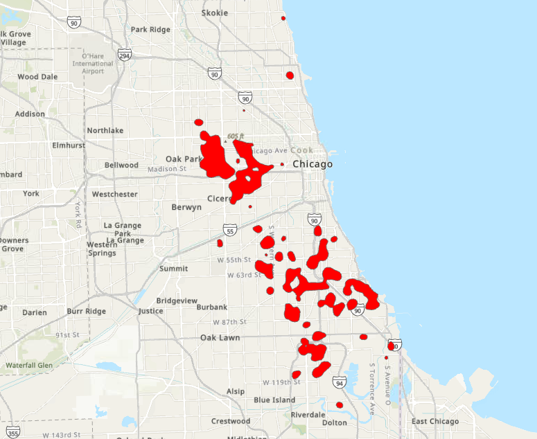
The grid overlay is performed by taking a measured grid shapefile, in this case it was of the boundary of the city divided into half-mile squared polygons, and measure the denisty of crimes within each polygon. We performed a simple spatial join to merge the point feature class of homicides in 2017 and the provided grid. We then selected the grids with the instances of homicide that were in the top 20% quintile to designate what constituted a high relative rate. After selecting by attribute the polygons residing within the top 20% quintile, we exported the feature class, dissolved the polygons into one multipart polygon and this was our hotspot result:

Next, we used the Kernel Density geoprocessing tool to create a hotspot map of the same 2017 homicides. Kerrnel Density hotspots display a continuous raster image of with severity variance illustrated by pixel value. This method weighs the input data points that reside closest to the center of a raster cells search area more heavily than those that reside along the edge. This gives each cluster of points a better communicated continuous look.
To illustrate only the hotspot clusters we adjusted the symbology of the feature class to only show three times the average and above and everything below three times the average. Thsi visually delineates the map into the tightly packed clusters and everything else. We relcassified the raster to split up these two value ranges and created a polygon feature class to contain and manipulate the attributes associated with the hotspots. The high value polygon was then extracted and this was the result:

Ultimately, what we would be looking for would be crime density. We had to think as if we were a polic force looking for where to distribute our resources to prevent the greatest amount of crime. Whiever method best highlights the greatest crime density would be the solution.


Comments
Post a Comment