This week's lab had us focusing on bivariate choropleth maps and proportional symbology. Throughout the course of the exercise, we were tasked with creating maps of these types communicating different ranges of data.
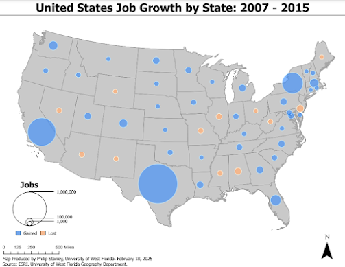
The first map (seen below) is a proportional symbol map which communicates positive and negative values. If this were to be a choropleth map, we would be using divergent color schemes to illustrate the maginutde of overall employment opportunity losses and gains. In this instance, to convey said magnitude, we opted for a porportional symbol map. The symbols used are roportional circles. They have been separated by hue choice to communicate the divergent data with orange representing negative values and blue representing positive. The size of the circles represent the colume of job gains and losses.
This was a rather difficult task due to the nature of maintaining proportion through symbology. Due to the nature of the range of data and needing to use two separate feature classes so size can be communicated for gains and losses respectively, one needs to ensure that symbols in each feature class representing the same magnitude of losses/gains are the same size (hence proportional).
The data range for gains was much wider with a far greater maximum than losses. When classifying, these allowed for greater variance in proprtional symbol size. With the smaller range in losses, the proportianal symbols had a much smaller size range. Getting the sizes for, as an example, 100,000 jobs to match up was rather finicky.
What needed to be done was I set the overall size for the lowest value to the point size (4 pt.). There was then consistency with the smaller value. I then set the maximum size for the jobs lost (where 100,000) was the largest class delineator to the size of the 100,000 value for the jobs gained. I further learned that null value (obviously) need to be eliminated as it will greatly warp the size capabilities and that the histogram can be adjusted to manipulate the classes and give one better proportion. If one uses the sliders in the histogram you can set the range of focus for the values in our attribute table. The jobs lost was split into fewer classes as there was less need to show the variance in order to keep the two congruent.
For a legend, I used nexsted circles labeled with lines and the representing values outside of the circles to make the legend more legible. The nested circles show the relationship between the proprtional values and their relative size to eachother to communicate the magnituude properly to the audience.
The maximum for the jobs gained was to be one million to communicate proper scope.
Below is the result:
With this analysis methodolgy, you are communicating the magintude of each variable and subsequently identifying areas where both variables exist in large magnitudes. It is important to choose complementary hues (ones that are found opposite on the color wheel) to represent the two variables as this allows the audience to differentiate the two clearly.
Before this can be done, however, the data needs to be joined into the same attribute table and the data needss to, essentially, be reclassified and one will be ascribed a numberical value and the other an alphabetical. In color selection, areas of low value need their symbology to be represented by a light hue with a low saturation and this needs to then be ramped up in value and hue to communicate greater intensity to show change in magnitude.
When creating the symbology for areas showing greater magnitude of both values, the hue value should descend in a mtered fashion and value will follow suit, however, usually with less of a change in the saturation value. Following this, you will notice you are blending the colors. With green appearing as my middle hue, naturally, a yellowish brown was the hue for high values in both variables.
To create the legend, as this is not an option in ArcGIS Pro (though in the latest versions it actually is now) the color values needed to be set to the same geomtry to create squares, they needed to transformed into a graphic (meaning they could not be further manipulated analystically) and ungrouped and manually rearranged. When arranging, it is impartive to essentially graph the variables with one standalone variable being on the Y-axis and the other on the X-axis. Due to these being labeled by both numerical and alphabetical values, the range low to high along the X-axis and on the Y-axis. With this having three classes, your top right corner value would represent the classification of C3.


Comments
Post a Comment